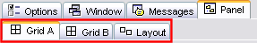
The final tab for the activities is, with the exception of text activities, Panel. The panel is the area which contains the real activity and it is here where the tools to create it are found.

The difference to the anterior ones is that this tab is not the same for all the activities. The options it offers differ according to the activity.
The text activities are an exception because when an activity of this type is created the tab Panel is in the tab Text. Everything relevant to this theme is detailed in module 4.
An activity can have one or two panels, depending on the type.
| TYPE |
NUMBER OF PANELS |
| Association |
simple |
2 |
| complex |
2 |
| Memory game |
1 |
| Exploring activity |
2 |
| Identification activity |
1 |
| Information screen |
1 |
| puzzle |
double |
1, although there are two, panel B is where the pieces of the puzzle are placed. The distribution menu exists. |
| exchange type |
1 |
| hole type |
1 |
| Written answers |
2 |
| Crossword |
2 |
| Wordsearch |
1, although there is the option of a second panel where the linked content appears. |
In the activities with two panels these are called A
and B, and in each of these, one works from a tab which is found when the tab Panel is selected.
Whenever an activity has two panels or grids, the tab Distribution appears from which you can establish the position of the two panels in the game window.
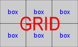
| In the majority of activities the panel is divided into boxes. Each box
is independent to the others, has its own content and can have its own colour, style, etc.
|
|
| This panel for example has 4 boxes with completely different styles and content. You can establish a certain style for each box using the window Box content,
which is opened by clicking on it.
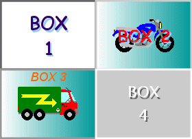
The changes made from the window Box content only affect the box where you are working and not the rest of the panel. |
The panels have common tools independent of whatever type of activity you are working on.
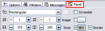
These tools are:
| |
The drop down list to select the type of shape generator. |
| |
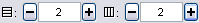
The buttons to determine the number of lines and columns the boxes will be distributed into. |
| |
The buttons to determine the sizes (width and height in pixels) of the boxes. |
|
|
The image button, which allows a background image to fill up the box. In this case the size of the image takes preference over the values indicated in the sizing box. |
| |
The activated option indicates that the boxes in the panel have a border. |
| |
Style button. This allows you to determine the type, colour and size of the letters used, colour and type of border, background colour...
All the characteristics decided upon in this button affect all the boxes in the panel.
If you want one box to have a different style it must be established from the window which opens when you click on the box. |
|